Wednesday, March 20, 2013

Steve McCurry

Steve McCurry's images are just so unique. The lighting and color are what make these photos stand out so much to me. I love that he doesn't specialize in one type of photography or another, but that he takes a variety of photos such as portraits and landscapes.

This photo is so simple, but it catches your eye and draws you into the girl's eyes. It makes you want to know her story and want to know why Steve took this photo!

I chose this photo because blue and orange are generally contrasting colors, but they work so well together in this photo. I love the expression on the man's face and how his reflection is seen in the mirror as well.

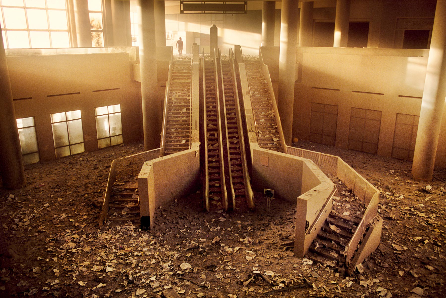
This photo (and the one below) are from a series of photos Steve took on September 11, 2001 in New York City, New York. The light shining through the window above is so beautiful but is shining on something so terrible.

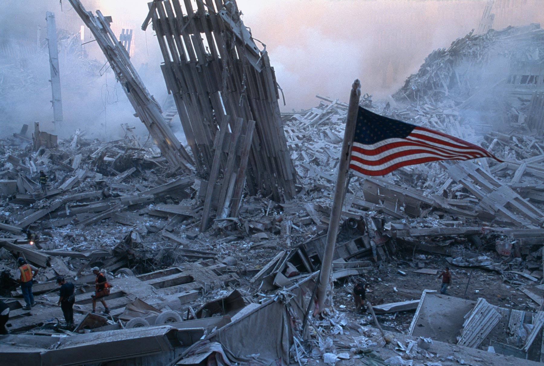
I liked how this photo captured both the destruction of the towers falling, but the flag as well. The flag is our symbol for unity, and Steve was able to capture that symbol still standing beautifully in the middle of the chaos. I also think this photo is interesting because the colors in this photo are so different from a lot of his other photos. They aren't as bright, and I think that helps give the viewer a somber feeling.

I love how he was able to capture this right as the water was smooth and calm. The value and lighting in the bush on the left, as well as on the sand, helps bring out the texture in both of them. I think it's interesting how the buildings in the background are reflecting over the water too.


See more of his work at: http://stevemccurry.com/


Monday, March 11, 2013

Bokeh

Bokeh is the aesthetic quality of the out-of-focus areas--so the blur--of a photo. Bokeh happens in the part of the image that is out of the depth of field. The way the blur in a photo looks is different in each photo, but the amount of blur has to do with the aperture settings and the lens.
 
My favorite style of bokeh is whenever the out-of-focus part of the photo creates little circles of color.  
 
It's more likely to happen whenever the background is far away from the subject, as well as whenever light is being filtered through something such as sunlight shining through leaves in a tree.

 It's also easier to get bokeh to happen in a photo whenever the lens allows the camera to have a smaller aperture, so using a 50mm lens would make this easier.
 
Though I don't have a 50mm lens, my 18-55mm allowed me to get the circular shaped bokeh in these four images above!
 
See more great examples of bokeh photography here!

Dorothea Lange

Dorothea Lange was a popular photojournalist during the Great Depression. She helped influence documentary photography. 


This piece is titled "Migrant Mother" because it's a mother with her two children as their family travels across the country during the Great Depression. The values in this photo help to show the worry lines and wrinkles in this woman's face.

 I like how Lange only focused on the boys instead of focusing on everything because it makes the photo so simple and unique. Rather than having pictures of little kids smiling and playing outside, she captured photos of what the kids were feeling about the depression as well.
 

Claude Monet

Claude Monet was a French painter in the late 1800's and early 1900's. He actually created a style of art: French impressionist painting. Monet is known for painting a multitude of landscapes. Here are just a few of his paintings below!

This piece above almost looks like a photograph when you look at it from a distance. The road that starts on the left of the painting draws the viewer's eye across the painting. 

I noticed that a lot of Monet's work is unique because of the different brush strokes he uses. In the photo above of the sail boat, he used a lot of short and thick brush strokes, especially in the sky and water. 

I chose to add this piece because of it's simplicity. I love the way he used a gradient of colors to make the sky and how he reflected those colors into the water. 

See more of Monet's work on his website!


Tuesday, March 5, 2013

Florian Ritter

Florian Ritter is a German photographer who currently lives in China. Most of his work involves landscape and portrait photography.

 
I really love the perspective of this photo and how the edges of the photo draw your eyes to the center rather than the other way around.

Here's another example of one of Ritter's landscapes. I really love how different and unique all of his images are. In the first image, the colors are dark and dramatic, but the second photo has soft, pastel colors that make the scene seem more peaceful. 

I love this photo above because it captures so much of the Indian culture in just one simple photo. The bright colors in the middle contrast perfectly with the outer edges of the photo.

More of his work can be seen on his website.